Custom Poker Chip Denomination Text Size: Readability on Clay and Ceramic
The number on the chip face is not decoration. It is how your guest knows whether they are calling $25 or 500 tournament points without lifting every stack. Hosts who cram eight lines of script into the ring because the centre “looked empty” on screen are the same hosts asking why nobody can read pots after the third beer.
This article goes deeper than the file-format section in our custom poker chips artwork guide — specifically how big denomination text should be, where to place it, and what clay vs ceramic actually reproduce. For rim colour contrast at large ceramic volumes, pair this with custom poker chip edge spots.
What players actually need to read
At a busy home game or club night, denominations must work for:
- Pot-sized bets — scanning a stack without picking up chips
- New guests who did not memorise your colour ladder
- Dim lighting — dining rooms and basement tables, not television studios
- Angle — chips lie flat; ring text on the outer arc shrinks visually
Centre-first is the rule: if the centre value is clear, ring text is optional branding. If only the ring carries the value, every seat needs perfect light.
Centre vs ring placement
| Placement | Strength | Weakness |
|---|---|---|
| Centre value only | Fastest read; classic casino | Less room for large logos |
| Logo centre + value ring | Strong branding | Ring values harder to read; keep ring short |
| Value centre + name ring | Best balance for home games | Requires layout discipline |
| Ring-only values | Looks clean in mockups | Fails in real play — avoid |
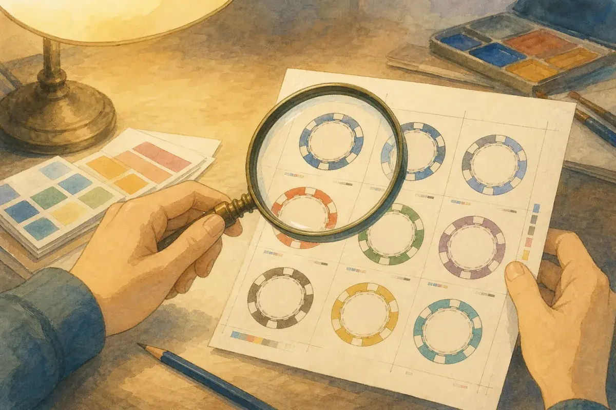
Label Studio (/custom-poker-chip-label-designer) helps you test dual-arc ring text and centre numerals on a chip-body preview before you quote. That is layout intent, not a manufacturing file — proofs still refine spacing.
Three design paths in the quote tool: Label Studio (free), own artwork upload (free), or full design service ($136) if you want the team to build print-ready art from a brief. They are separate options, not a required pipeline.
Clay inlay vs ceramic direct print
| Factor | Clay (printed inlay) | Ceramic (direct-to-chip) |
|---|---|---|
| Fine lines / small type | Strongest | Good for bold type |
| Printable face area | Same as ceramic | Same as clay |
| Durability | 25,000+ impact cycles | 50,000+ impact cycles |
| MOQ | 500 chips | 300 chips |
| Best denomination style | Centre + detailed ring | Large centre numerals, minimal ring |
Never claim ceramic has a larger print area or sharper micro-text than clay. Clay wins fine detail because artwork prints on a paper inlay set into the face. Ceramic bonds ink directly to the chip — excellent for bold graphics, less forgiving for hairline serifs.
Material choice when readability is the priority:
- Photo crests, thin serifs, crowded ring copy → clay
- Bold centre values, heavy weekly play, 300-chip first order → ceramic
Compare feel and construction: clay vs ceramic custom poker chips.
Practical sizing rules (before proof)
These are hosting-first guidelines — not pixel specs — because production proofs account for bleed and CMYK spread.
Centre numerals
- Use one dominant numeral — 25, 100, $5, 1000 — not a paragraph
- Tournament: unitless (500 not $500)
- Cash: include $ on the face ($25)
- Avoid thin script fonts for the value itself — sans-serif or bold serif numerals read faster
- Leave margin inside the safe zone — artwork that kisses the edge gets trimmed in production
Ring text
- Short words only — host name, year, “LEAGUE”, not mission statements
- If the ring also carries a value, treat it as secondary — duplicate the centre value only when contrast is high
- Tracking (letter spacing) matters on arcs — mock in Label Studio rather than guessing in Word
Colour contrast
| Background | Text |
|---|---|
| Dark centre | White or gold numerals |
| Light centre | Black or deep navy |
| Busy photo centre | Solid colour plate behind the numeral |
Brand palettes inspire design; table readability wins. The design brief checklist captures contrast notes for the proof team.
Cash vs tournament typography
| Format | On-chip copy | Example |
|---|---|---|
| Cash | $ + numeral | $1, $5, $25 |
| Tournament | Numeral only | 25, 100, 500 |
Mixing both formats on one inventory? Use different layouts or colour families so 500 never sits beside $25 on the same green body. Full dual-format planning: one set for tournament and cash.
Proof stage: what to check
When the factory proof arrives, zoom out — literally:
- Arm’s-length test — can you read the centre value on a phone screen at roughly chip size?
- Glance test — show someone the proof for two seconds — do they know the denomination?
- Contrast check — does any text sit on a busy photo without a backing plate?
- Set consistency — do all denominations use the same numeral style?
- Cash vs tournament — any $ on tournament faces by mistake?
Sign-off timing: print-ready vector often proofs in a few days; brief-only jobs run ~1 week typical. Details: custom poker chip proof approval.
Common mistakes
| Mistake | Why it hurts | Fix |
|---|---|---|
| Ring-only denominations | Unreadable in play | Centre value mandatory |
| Micro serif on ceramic | Ink spread blurs strokes | Bold centre or switch to clay |
| Low-contrast brand colours | Pretty mockup, blind table | High-contrast numeral plate |
| Paragraph ring text | Arc text becomes illegible | One line max on ring |
| Skipping proof | Production surprise | Approve factory PDF at size |
| Tournament $ sign | Cash-out confusion | Unitless tournament values |
Tools and next steps
- Draft centre numerals + short ring in Label Studio
- Or upload vector art per the artwork guide
- Note cash ($) vs tournament (unitless) on the design brief checklist
- Get an instant quote — attach mockup or files on the summary step
Readable custom poker chip denomination text is a layout and material decision, not a font download. Size for the worst seat at your table, sign the proof, and your stacks will read as clearly as they feel.