

Poker Chip Design Ideas: Build a Set Players Can Read
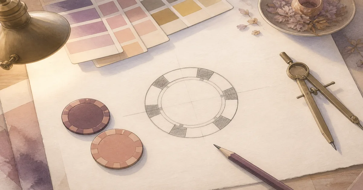
The best poker chip designs are memorable without making players squint. Start with one strong idea, then make every denomination easy to identify in play.
The best home-game sets feel personal because they reflect the group, not because every millimetre is filled. A favourite venue, a club crest, a wedding date, or a private joke can all work when the playing information remains clear.
Start with one idea players will remember
Choose a single visual anchor: a monogram, a simple mascot, a place, or a small emblem that has meaning to the group. Put it in the centre and let the ring carry supporting text.
If the chip is used for cash or tournament points, the value needs equal priority. A guest should be able to pick up a stack and understand it without asking the dealer. The denomination text-size guide is a useful check before you lock the layout.
Build a colour system for play, not the shelf
Colour should help players separate values. Use a strong contrast between adjacent denominations, and avoid two similar dark greens or reds that become indistinguishable under warm light.
| Design choice | Practical test |
|---|---|
| Centre numeral | Read it from across the table |
| Body colour | Tell it apart from the next value |
| Ring text | Keep it short enough to breathe |
| Edge detail | Use it as a cue, not the only cue |
Standard cash colours can be a useful starting point, but a printed value is always clearer than a convention. For ideas that work for different eyesight and lighting conditions, see colour-blind-friendly custom poker chips.
Match the art to the chip construction
Clay uses a printed inlay and is the stronger choice for fine crests, photos, and tiny type. Ceramic prints directly onto the chip face, so it is excellent for bold, high-contrast designs with no separate paper inlay.
Both have the same printable face area. The choice is not about gaining more room. It is about whether fine detail, a bevelled casino feel, durability, or the 500-chip minimum matters most. Compare them in clay versus ceramic.
Make a proof before you fall in love with the screen
A full-screen mockup hides bad spacing. Review the proof at chip scale. Check the spelling, the centre balance, the value hierarchy, and whether the colours separate when several chips are stacked together.
You have three routes to a proof: upload print-ready artwork, create a free starting layout in Label Studio, or ask for the full design service. The proof stage is where an idea becomes a set people can actually play with.
Turn the idea into a set
Keep the visual identity constant, vary each denomination clearly, and make the face useful from the first hand to the last. When you know your quantity and material, get an instant quote to price the full set.